
PublishPlot
Creating Stacked Plots
Description
When comparing a series of trend lines, all of which are positive and in a similar range, converting the data to a stacked plot might give improved visualization of the results. A stacked plot displays each curve as a sum of all previous curves plus the data in that curve. Each curve is thus represented by the difference between two curves. The regions between the curves are usually filled with a solid color.
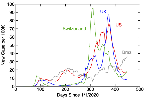
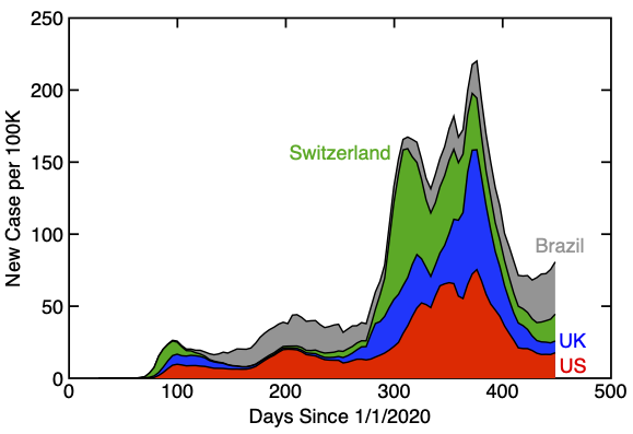
The following plots provide an example. The plot on the left shows trend lines for four countries for number of new Covid-19 cases per capita as a function of number of days since 1 January 2020. The data is through 25 March 2021. The plot on the right shows the same data in a stacked plot. Differences between curves show results for each country and now shows then in a non-overlapping style.
Script Downloads
| Script Name | Installation Steps | Date |
|---|---|---|
| Stacked Plot |
|
4 Apr 2021 |
Using the "Stacked Plot" Script
Before running the "Stacked Plot" script, you have to prepare the initial plot. First, create one or more curves for which all Y values are positive or zero. Next, select different line colors for each curve. Those line colors are used for the regions between curves in the stacked plot. Finally, choose "Stacked Plot" from the "Scripts" menu. The new plot will appear in a new window. It will be set to same size as the original plot and copy over the labels for X and Y axes. Text labels in the original plot (e.g., country names in the above example) will not be copied, but can be dragged over as needed.
The stacked plot also works for built-in bar charts and creates a stacked bar chart. The only difference is that you should set the symbol fill colors of the original plot prior to choosing "Stacked Plot" from the "Scripts" menu. The following figures show an example of converting a bar chart to a stacked bar chart.
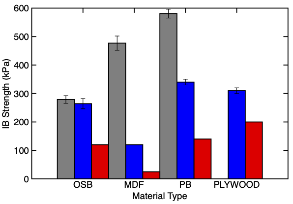
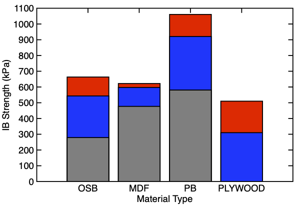
Note that the stacked bar chart is actually a numeric plot (this approach was needed to support the stacking). See the PublishPlot help on bar charts for the differences between built-in and manually created bar charts. The stacked chart tries to pick a good bar width. The widths can be changed in the resulting plot by editing symbol size of each curve.